The National Academy of Design welcomed its newest class of National Academicians last fall, 15 extraordinary artists and architects who join a community dating back to the founding of the National Academy in 1825. Learn about the election process and watch the Induction Ceremony here.
As part of the celebrations, the Academy’s recently appointed executive director Gregory Wessner interviewed incoming members about their work and ideas, and how the upheavals of the past year have affected their practices. Conversations will be released in the coming months.
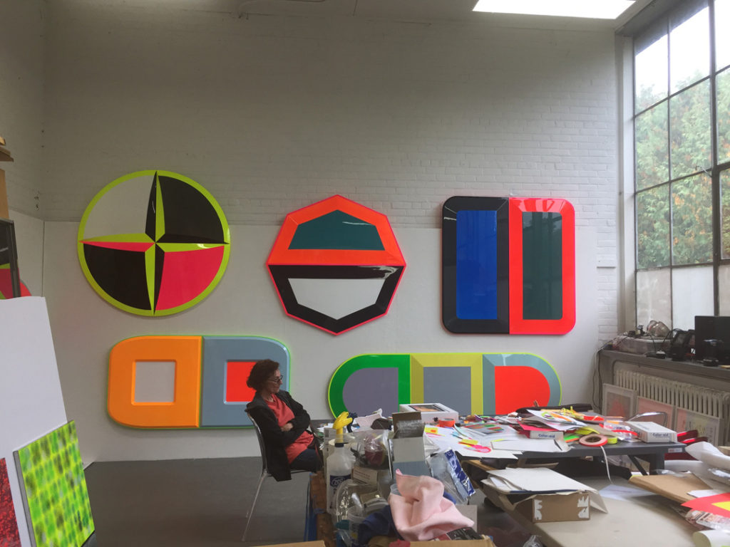
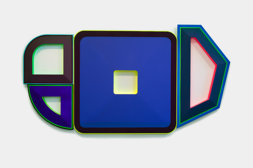
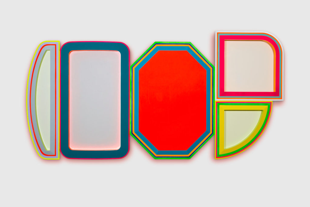
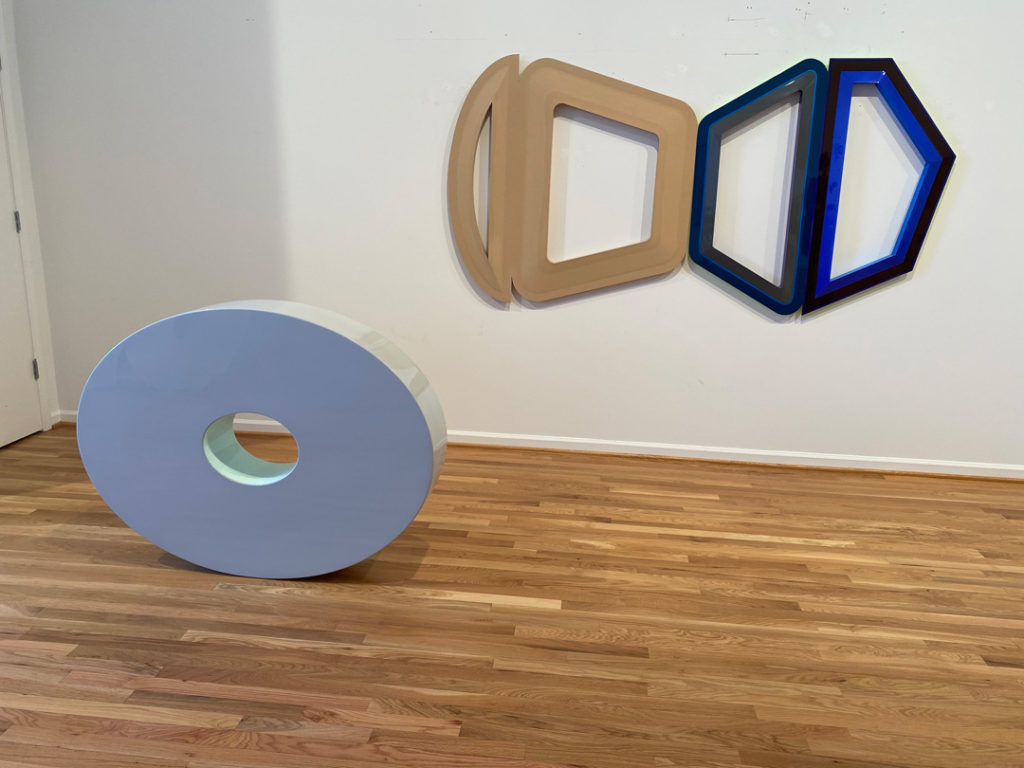
Beverly Fishman (NA 2020) is an artist based in Detroit, Michigan. Her glossy, three-dimensional works are influenced by the imagery, advertising, and power of the pharmaceutical industry. She researches how science, technology, and medicine affect our bodies and minds, and uses what she learns in her creative work. Here, she discusses the 26 years she spent as an artist-in-residence and mentor at the Cranbrook Academy of Art, how advertising has propelled the pharmaceutical industry’s growth, the placebo effect, and more.
Gregory Wessner: Thanks so much for taking time to talk with me. We’re excited to welcome you to the Academy! How has your lockdown been?
Beverly Fishman: Well, it’s gray in Detroit in the winter. But I am so fortunate because when I left teaching, we purchased a building here. Detroit is still affordable, no matter what anyone says—you can find a deal. I live upstairs, and I walk down a very good set of stairs, open the door, and I’m in my studio. Had that not happened, I would be having such a bad experience during the lockdown. Many other artists have not been able to get to their studios because the buildings were closed.
The pandemic has pushed some of my exhibition dates further away, and it has ended up being positive for me because I haven’t had continuous outside pressure. Of course, I want the pressure; I accept what I accept.
When I interviewed Charles Gaines (NA 2020), he said something very similar about how the pandemic reconnected him to the studio in a way that he hadn’t been for a long time, because there used to be all these distractions—the business of being an artist, the meetings and the openings.
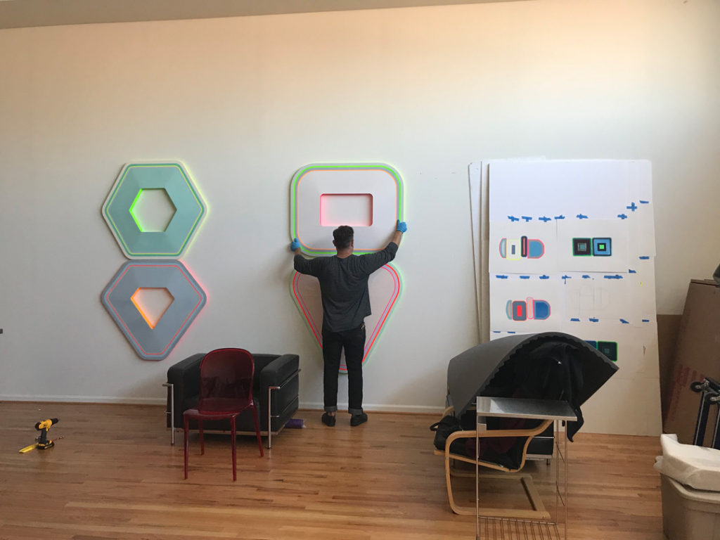
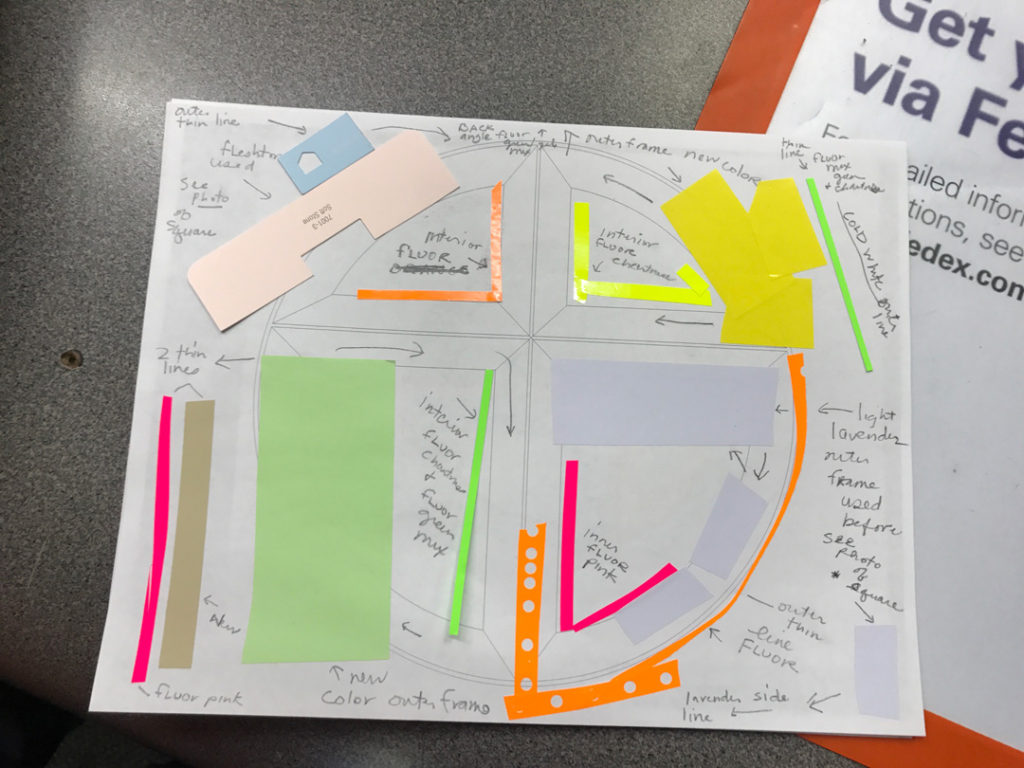
I have fabricators that I work with, and they work for me full-time, but they don’t actually work in my studio. I am mostly alone in my studio, where I cut and paste paper and vinyl to work out the colors and forms that my paintings take. There were times when I was working side by side with someone, but as I’ve gotten older, I need the mental space of being alone. I’m very private. I use fabrication, and pieces have to go back and forth to the fabricator if they’re not right. When I get a piece back and the color isn’t doing what I want it to do, it goes back to the fabricator and I’ve got to orchestrate all that. It is a hassle, but it allows me the freedom to sit on a chair and think in an uninterrupted way. The creation of art, a lot of times, is literally sitting, thinking through, or staring.
I saw that you only just recently stopped teaching, right? When did you stop?
May 2019. I had been at Cranbrook as Artist-in-Residence and Head-of-Painting for 26 years. At Cranbrook, the artists-in-residence live and work on the campus. It’s part of our position. So, when I chose to retire, it meant everything had to change. When normal people leave a job, they don’t leave their home, studio, and community. When I decided to leave, I honestly felt like I was leaving a community and a practice of mentorship to which I had given my whole heart. But more and more things were happening in my career, and I was absolutely ready to leave. More than ready—I had to.
You have so much space now, with the new studio. How did you manage the space issues at Cranbrook? Do you work on a lot of pieces simultaneously?
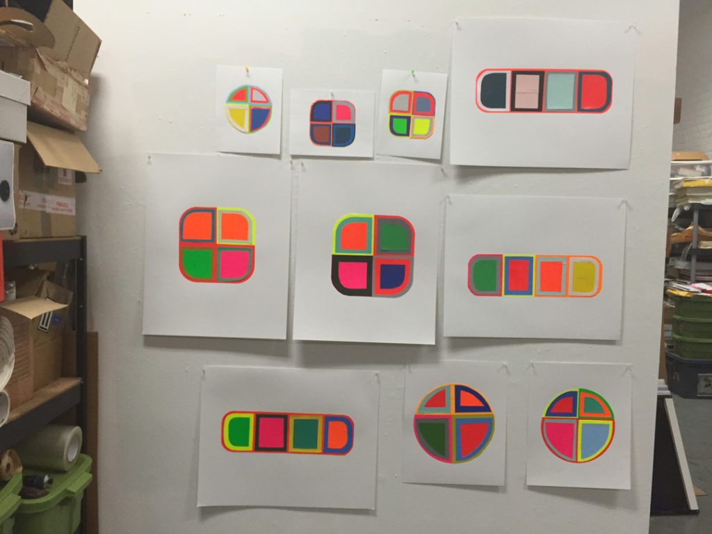
Not really. I make collages, and I’ve worked on a ton of those at the same time. That’s how I get the ideas. From there, we build the form offsite. It comes to me, and then it goes to a painter I’ve worked with for maybe eight years. The paint is toxic. I can’t be around it. I’ve hit the toxic limit from how many years I worked with it incorrectly.
When the work comes back, I look at it, and I either accept it or reject it. A lot of times, things sit on the wall and I continue to look at them. If they don’t make sense to me, they have to go back and be repainted.
Do you first decide on form and then paint, or are you adjusting both while the work comes together?
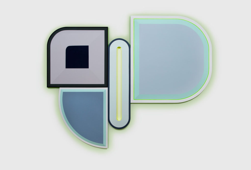
I think it’s now playing back and forth. A lot of it has been evolving conceptually with my ideas about pills and tablets. In the early stages of my polychrome reliefs, the works between 2012 and 2016, the forms were based on single pills. So, even though they are abstract and even though I’ve made them gigantic and even though I’ve changed the color, if you see a particular pharmaceutical, then you recognize it and perhaps identify with it. You can see the form—Xanax, for example—and know what it is.
Then, in the last couple of years, I’ve moved to an idea of polypharmacy: A medical concept that tries to deal with the fact that most of us are on several pills by the age 45, and by 65 we can be on 8 pills, and by the time we’re 80, we might be up to 18 pills. Because the pills and tablets I’ve based my forms on have scores on them to divide them, I’ve broken up the individual pill forms, and now I create compositions of pharmaceutical fragments. I’ve also excised some of the interiors of the pill fragments to create thin outline shapes. You can’t do that with real pills, but I wanted to convey a sense of active interiors, or powerful material forces lying beneath the machine-like surfaces.
This is a good segue into research. I’ve been really interested in this question in talking to this year’s artists. So often attention gets focused on the finished work, and we tend not to talk about the work that goes into making the work. You spend a lot of time on research.
In the 1980s, I started dealing with identity through cellular imagery. I was obsessed with everything under the microscope and with the minute differences that can make one life totally different than another, like those between one brother and another brother.
Then I became more aware of the cures that were being sold to us, and how they had become so culturally loaded. In 1999, Prozac was the big cure for depression, right? It was an interesting cultural moment, where we were being asked to work all the time. We needed to be productive all the time, or at least a lot of the time. So, Prozac being held up as a cure meant that we were no longer being asked to delve into the deep psychological sources of our depression and to develop introspection through the long process that you spend in therapy, but rather to do something quicker, something that wouldn’t take years. You could just pop a pill, feel better, and get back to being productive. Of course, this is not in any way to make light of clinical depression, of real anxiety. There’s no question that it’s real. It’s chemical, and you can do something about that, which interests me because the chemistry continues to evolve. Now, Ketamine and MDMA are being introduced. They’re finding incredible success as drugs for depression, and someone who has suffered from depression is going to try anything they can to live a decent life. So, drugs for depression help immeasurably, but at the same time, they also cover over things in our personalities that we really should explore.
What was happening in the late 1990s and 2000s was that everyday conversations really shifted. Women were starting to talk about the pills they took for depression. That discussion had been taboo for a very long time. You never talked about the medicine you were on. You would never even say the word “depression.” And then suddenly mental health became part of a conversation that could be held more openly.
Once, I was having dinner with a friend—we’re still friends—and I didn’t feel well. She opened up her handbag, took out a pill box, and said, “I have everything from antacids to anti-anxiety. What do you need?” And every single square had a different pill in it.
She was like a walking pharmacy.
Exactly! No one ever talked about taking medicine, and then suddenly it became a more regular thing to do. My mother was part of the “Valley of the Dolls” generation—it was in her age group that suburban women were beginning to be prescribed Valium much more frequently. People were given Valium to “take the edge off,” and the company knew their medication was addictive for 15 years before its dangers became public. Before the Opioid Crisis—the explosion in addiction to pain medication—there was a growing addiction to anxiety medication: A less-well-known crisis that affected women in particular.
We all know the underlying problem with the healthcare system is that when it becomes a profit center, it’s to the company’s advantage to keep you sick and needing more. How do you reconcile the good that can come from it?
I’m all for medication. If you’ve come out of surgery, you need pain management. But you have to be smart about it. If you look at some of the countries in Europe that provide pain management pharmaceuticals, they don’t give the person a three- or a four-week supply. They give you a much more limited amount. They’ve done research that shows that within three weeks you could become an addict, so they start you off with less and they monitor you more closely.
Everybody who comes to my studio tells me personal stories. It’s, “My mother became an addict…,” or, “You’re never gonna believe this, but my father is on…” I had a curator cry in my studio, and they said that they would not show my work because it upset them too much due to their own personal history. Everyone knows someone who’s had a problem with medicine—not necessarily with addiction, but with drugs hurting not helping. This is how common it is, yet we don’t really talk openly about how and why it’s occurring.
My sister who passed away was on medication since she was a teenager. The medication ended up doing her harm, but she got four more decades out of her life than she probably would have if she didn’t take it. That’s the trade-off. And I say that with great sadness, but her quality of life would have been much different had she not had the medication. I understand this from both personal and research points of view. You’re not going to worry about the thing that’s decades away if you can’t get out of bed.
But like you say, the trade-off should be informed. You should know what you’re getting into and understand the pros and cons.
Right. When you pick up medicine and read the side effects sheet that the pharmacy gives you, it can be petrifying. I also study advertising, so I’m a sucker for beautiful wrapping. You give me beautiful packaging, I’m in. I don’t even care what’s inside, I’m seduced. I get it.
People say, “Why pharmaceuticals?” I’m like, “Well, at certain moments they’re everything.” Every single thing you own and buy is a lifestyle choice. The glasses you have on have a story.
These? They’re Warby Parker.
They’re hip, and they’re not too expensive. Can good design be inexpensive? Yes, in my opinion. Target showed that a zillion years ago—having designers come in and design affordable things. I worshiped “Tar-jay” because at Cranbrook, the top designers were Katherine and Michael McCoy. Kathy brought me to Target in 1992. I had never been there before. She discussed with me how good design could be affordable, and she brought me through the aisles and educated me: “You can spend this amount of money, or you can spend this amount of money.” There are people that only want to spend the top dollar because it makes them feel better. “If I’m wearing Prada, I feel better than if I’m wearing the knockoff.” It rubs off. Personally, I do feel better in the name brand, but I also like much more anonymous and affordable design.
Actually, that reminds me I want to circle back to Cranbrook. You were there for 26 years. That must have been an incredible experience.
It really changed my whole life. I could have gone into design. As a young art student, there was a famous designer who was teaching in Philadelphia who thought I should be a designer. At Cranbrook, I was close friends with the 2D and 3D designers, and I collaborated with a couple of them making products. I’ve always had a great interest in the relationship between design and art and blurring that boundary.
You can take any industry—the sneaker industry, for example. Are you an Adidas person? Are you a Converse fan? You identify with the brand. Most people are brand loyal, through and through. If something’s worked, why change? Brand loyalty is everywhere and in every single thing we own. What I learned studying pharmaceuticals is that Big Pharma designs pharmaceuticals so that you will remember them, so that when the generic pill comes out, you will stay with the more expensive brand name, because you feel it works better.
Even pharmaceuticals are using design to develop brand loyalty? With pills?
It’s a trillion-dollar industry. Why wouldn’t they use design? The name of the pill and its design are carefully tweaked so that we remember it, and so that it connotes whatever that company wants and needs it to imply. Then, when the generic comes out, there are a lot of people that feel the brand’s pill works better. Now, I have to tell you, that could be true, because in my research I discovered that in some cases the generic isn’t an exact copy of the prescription pill.

It is sort of shocking how little we pay attention to what we are putting into our bodies when it’s prescribed by a doctor. Even if we read the side effects, we accept, “Oh, I’ll just do this. The doctor prescribed it.”
That gets me into research I’ve done on the placebo effect. Ted Kaptchuk, a professor of medicine at Harvard Medical School, carried out a number of studies on this, and he talks about how size, color, shape, and other seemingly non-chemical characteristics affect the potency of medicine. As The New Yorker reported in 2011:
In most cases, the larger the pill, the stronger the placebo effect. Two pills are better than one, and brand-name pills trump generics. Capsules are generally more effective than pills, and injections produce a more pronounced effect than either. There is even evidence to suggest that the color of medicine influences the way one responds to it: colored pills are more likely to relieve pain than white pills; blue pills help people sleep better than red pills; and green capsules are the best bet when it comes to anxiety medication.1
It’s fascinating how much the placebo effect affects our wellness or illness. It’s been documented that when you have a headache and you hold the pill you’re going to take in your hand, your body is already putting out chemicals that say, “I’m going to feel better.”
My mother and I had a complicated relationship, but in the last three and a half years of her life, it was just magnificent. She had a cancer that was not curable, and the doctor gave her three weeks to three months to live. When she got to a year, she went to the doctor and said, “How am I doing?” The doctor said, “You’re alive. You’re doing well.”
Three years in, and she’s alive. Towards three and a half, the doctor said to her, “Shirley, there’s nothing more we can do. We’ve done everything.” And she said, “Really?” They answered, “Yes.” And within a very short period, she declined and died. I truly believe had they given her a placebo, she would have lived longer. I don’t know that for a fact, but I do know my mother’s spirit and her drive to be with us. Would it have been years? Who knows? In the West, we don’t study the miracles. We study the law of averages. You go to the doctor and say, “I have this,” and they say, “Well, you’re going to die within this amount of time.” They don’t study the person that’s outside the range.
Right. And how much information and useful data could we get by studying those people?
I think we’re getting more and more into it as we open ourselves up to alternative medicine and treatments. Even in hospitals, everyone is thinking more about a “wellness” part.
I did a collaboration with an incredible doctor from the University of Michigan, Eva Feldman, who was studying amyotrophic lateral sclerosis (ALS). She was looking for a cure. There was a huge research center that she was heading up at the time. We were matched for an art project, and I adored her. My uncle had died from ALS, so I thought it was the perfect match. We met privately a couple of times. Then, I made art in response. It sold, and the money was given to the research center.
We were talking on stage to an audience, and Eva announced that she thought that food needed to be considered a medicine. Beyond serving as a source of nutrition, food has a powerful effect on the body. She wanted the ability as a doctor to prescribe food, because especially in poor areas, people couldn’t get the nourishment they needed—the foods that could help them. She was speaking about that very forcefully, and I think she’s right.
It’s a radical idea, not the tie between food and nutrition, but the idea that if she could prescribe food, it enters an entirely different system of economics. People might have better access to nutritious food if it could be prescribed as medicine.
She’s absolutely amazing. She took me through the whole research lab, and I met with all the doctors and took some of their microscopic images to use in the artwork. I thought it was phenomenal for a researcher to go on this lifelong journey hoping to find the cure for a specific disease, but along the way to also find these incredible connections with other aspects of human health. I connect that process to art.
What is the role of artists right now in helping to shape conversations around issues like this?
I think it’s as individual as the artist. In the late 80s, I was buying medical books looking at the viscera. I was interested in the body and in who we were on a physical and organic level. That led me on this very long journey into scientific imaging, DNA codes, street drugs, and pharmaceuticals. I can’t imagine inventing from intuition alone. For me, the art has to be connected to the world.
In the video you did for the Induction Ceremony, you talked about how important mentorship was to you. How does that continue in your life today?
When I was a child, I dreamt of two things—being an artist and being a teacher. I was very fortunate that my dreams came true. I dreamt them, and then I was on a path. I continue to mentor. I mentor people my age. I pretty much mentor anyone who wants it.
I’ve also had incredible mentors my whole life. To this day, there are one or two people that are ahead of me, and I ask them for counsel and for feedback because I respect what they’ve done. I respect who they are. For me, it’s part of being alive. I don’t separate it. That’s who I am.
That’s beautiful.
The new Heads-of-Painting at Cranbrook have invited me back to do critiques. I love it, but it’s so much work. I’m doing it again this spring, but how I do it is not just from the neck up—it’s heart and soul. Looking at each student and who they really are, and what their needs are. This sounds so Pollyanna, but it’s true! A lot of times with mentoring, it’s about wanting them to be the best artists they can be. That’s my goal.
For most of my educational career, I taught graduate students, so they were older. What I hope anyone would see in my mentorship is that I always sought to develop individual artists—idiosyncratic young artists; not a “style” at all. You’d be shocked to learn which particular artists worked with me. My ego was not about any kind of mimicry. To me, that was the worst thing. It meant they weren’t doing what they should have been doing.
I miss teaching, but I don’t miss expending all that energy on pedagogy, and I don’t miss the administrative part. So, I’m finding ways to still be positive and to give back to the discipline, but not so much that it takes over my life, because I’ve got to focus on my work now. I have exhibitions planned through 2023, and I’m saying to myself, “I don’t know if I can do all this.” And then I think to myself, “Well, why not? What else are you doing?”
The National Academy of Design welcomed Beverly Fishman, along with Derrick Adams, Cecily Brown, Enrique Chagoya, Mitch Epstein, Rafael Ferrer, Charles Gaines, Carmen Herrera, Michael Maltzan, Toshiko Mori, Jennifer Packer, Walid Raad, Betye Saar, Beverly Semmes, and Claire Weisz as National Academicians on October 28, 2020.
Gregory Wessner is the Executive Director of the National Academy of Design. Previously, he served as Executive Director of Open House New York, and has also worked at the Architectural League of New York, the former National Academy of Design School of Fine Arts, the Parrish Art Museum, and White Columns. In recognition of his contributions to art and culture in New York City, Wessner recently received the Award of Merit from the American Institute of Architects New York. Wessner did doctoral research in art and architectural history at the Graduate Center of the City University of New York and completed undergraduate studies in Art History at Rutgers University.
Beverly Fishman (NA 2020) is an artist who adopts the language of abstraction to explore the body, issues of identity, and contemporary culture. For more than three decades, she has used imagery drawn from science, medicine, and the pharmaceutical industry to promote inquiry into the effects of these institutions on both individuals and societies. Fishman’s work has been the subject of over 35 solo exhibitions at galleries in Berlin, Chicago, Detroit, London, Los Angeles, New York, Paris, St. Louis, and Thessaloniki, and her work has also been the subject of exhibitions at the Chrysler Museum, the Columbus Museum of Art, the Detroit Institute of Arts, and the Toledo Museum of Art, among others. Her Instagram handle is @bev_fishman.
- Michael Specter, “The Power of Nothing,” The New Yorker, December 5, 2011.