Ours may be the only country with a “National Mall.” A mall with grass and museums instead of chain stores—museums that constitute the cultural franchise that is the Smithsonian Institution. Fan of famous faces? Head for the National Portrait Gallery. Admire airplanes? See the Spirit of St. Louis at the Air and Space Museum. Avid about African American culture? Stroll over to the National Museum of African American History and Culture. Interested in American Indians? Step over to the National Museum of the American Indian and ask yourself why. Americans, the current must-see exhibition at the museum, goes a long way in helping you answer that question. And it does so with stealth and smarts, such that it’s drawn acclaim from former critics of the museum like Edward Rothstein and Peter Schjeldahl.
Once populous, American Indians are a scant demographic on the continent these days, and chances are you don’t know any. None besides, to quote Smithsonian curators Paul Chaat Smith and Cécile R. Ganteaume, the ones “in your head, in your pantry, and in your garage.”
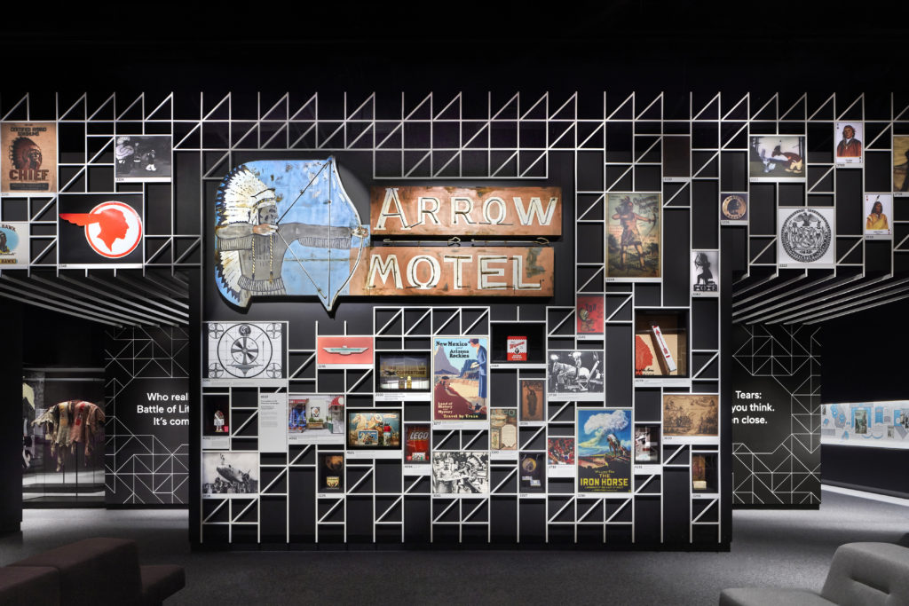
Americans greets you with a spectacular main gallery that is one of the most memorable and memory-provoking rooms in a museum you may ever see. Bedecked floor-to-ceiling on steep black walls, ordered by a white metal grid, are hundreds of images of Indians from advertising, movie posters, state seals, sports teams, currency, and more. Indians Everywhere, its title and theme, resounds in the space, from the mint 1948 Indian Chief motorcycle, one of its few three-dimensional objects, to the endless repetition of Indian heads and names hawking everything from flour to missiles.
Signage draws you into side galleries themed: The Invention of Thanksgiving; Queen of America; The Removal Act; and The Indians Win. The titles signal a different museum voice, one that ironizes brutal histories and addresses you like a thinking adult. In it I detect the brilliant, snarky voice of my Comanche comrade Paul Chaat Smith, who with Cécile R. Ganteaume and a host of talented collaborators, created Americans and shepherded it through its stages from concept to consummation.
Towards the end of a tropical Manhattan August, I had the pleasure of speaking with its stellar designer, architect Wendy Evans Joseph (NA 2012), founder and principal of Studio Joseph, about Americans at her Midtown office.
Alan Michelson: As an architect, how did you gravitate into exhibition design?
Wendy Evans Joseph: Before starting my own practice, I was with Pei Cobb Freed & Partners’ office. There, I worked on the United States Holocaust Memorial Museum in Washington, DC. When we started the design process, I made numerous research trips to concentration camps, to Israel, and other memorials, and met with survivors and scholars.
The entire building is an expression of content, infused with the tragedy of that history. One enters and is immediately transported to another world that takes its clues and emotional value from some of the places that we had seen and the atrocities that we learned about. These are expressed in the architecture.
To some, it may be too cinematographic, but the design’s success with visitors caused me to realize that architecture itself has emotive force, and that captivated me. The whole museum environment tells the stories.
When I founded my practice, Studio Joseph, my very first project was a museum [The Women’s Museum in Dallas, Texas]. I hadn’t at that time designed exhibitions, but I wanted to tell the story, and I tried to embed meaning, once again, into the architecture.
I started to design museum exhibitions around 2005, and initially the content was related to art or architectural display. We worked with MAD [Museum of Arts and Design], here in New York, on numerous shows for the presentation of objects and furniture. We designed a show for Kehinde Wiley at the Jewish Museum, which included a dialogue between painting and historic artifacts. Building on those early shows, we started navigating the difficult terrain of content-driven exhibitions that tell a story with many artifacts, objects, and technology. We have worked often with the Museum of the City of New York.
Americans is certainly content-driven.
Absolutely.
In his book, Everything You Know About Indians Is Wrong, Paul Chaat Smith wondered if the Smithsonian National Museum of the American Indian should be the Louvre or the Holocaust Museum. How would you classify the NMAI? What kind of museum is it?
I think there’s a sort of trifecta of similar museums on the Mall—the Holocaust Memorial Museum, the National Museum of the American Indian, and the National Museum of African American History and Culture. All deal in different ways with man’s inhumanity against man. There are difficult truths in all three of these institutions.
And this is why Paul [Chaat Smith] poses Americans by presenting historical facts opening, not closing, the discussion. It is an exhibition that grows out of and is framed by its location. The questioning comes up in this show in a way that it hadn’t in the previous permanent collection exhibitions in NMAI. This is part of a new way of thinking about the museum that navigates a more complex terrain. The way the curators were able to traverse is by presenting facts that engage the public actively, not passively. Cécile R. Ganteaume says, “What we choose to remember and what we choose to forget makes us who we are.”
Americans is organized into five sections: Indians Everywhere, The Invention of Thanksgiving, Queen of America, The Removal Act, and The Indians Win. How familiar, or maybe unfamiliar, were you with those histories?
I think I knew these topics, but they each had meaning to me in different ways. Everyone has their personal relationship with Thanksgiving. But as far as the other histories? No, I didn’t fully understand their consequences in the way that I do now. I didn’t understand what they tell us about our country. That wasn’t clear to me until I worked with Paul and Cécile.
Similar to other museum visitors, I studied the Battle of Little Big Horn as a massacre, and the Indians won. The implications of it, the way the battle dovetailed with other events in the American psyche at the time, and how it continues to have resonance, is fascinating and is a story that has not been told before.
Take us through the process of developing this exhibition.
Initially the design team came together in a workshop with the curators and other NMAI staff. We each put our preconceptions on the table and talked openly about what we thought and why. Topics were massaged to some extent during the two-year process, but we began with the specific histories that the curators found pivotal and those remained throughout. I remember, though, a key moment in an initial design meeting when we each were asked, “What spaces are crucial?” Paul pushed all his chips to the middle of the table, and said, “Indians Everywhere is the central experience.” I realized then that to drive his narrative home that section had to literally be the center of the show: the anchor; the core story; and a physically powerful place.
Often visitors come to the museum [NMAI] as a form of cultural tourism. They don’t know if it’s an art museum or a history museum, or what to expect. They bring their children and show them indigenous arts. They buy a dreamcatcher in the shop. They go home, and they leave Indians “at the door,” many believing that Indians play no role in their lives. NMAI has over a million visitors a year, so of course, there are many who know otherwise and they are also part of our audience. Americans boldly presents that Indians do play a strong role in American life.
The show doesn’t just present iconography. It talks to why Indian images, names, and stories are an integral part of the American landscape—how it happened, what were the key moments in our history that solidified their presence. That idea is the driving force behind the show.
And it’s not a pretty story.
It’s not a pretty story, and this show is not a prettification of history, by any means. If you are a sensitive, engaged person, you will leave Americans with a hole in your stomach.
I want to talk about Indians Everywhere, because it really is the centerpiece of the exhibition. And it serves a certain strategic purpose. It’s a sort of 21st century wunderkammer—hundreds of Indian images of different size hung salon style, floor-to-ceiling, on an elegant white steel lattice against black walls and a dark ceiling. It’s an enveloping space with very attractive couches, very clean and very modern.

It’s an odd sort of environment, at once grand and intimate. It also triggers, and, I guess, is supposed to trigger, a weird nostalgia in Americans, even in Indians. And it certainly goes a long way towards making Paul’s point that, “We’re in your head, we’re in your pantry, we’re in your garage.” ’There are so many—in many cases, beautiful—advertising images of Indians used for food and automotive products and so on.
It’s confronting audiences with the contents of their collective unconscious, but with a positive spin—minus the guilt trip. But given our national moment, in which an American president repeatedly taunts a female senator with the nickname Pocahontas, and does so in a White House ceremony supposed to be honoring Navajo Code Talkers, and routinely insults Muslims and immigrants and African Americans, could the presentation of stereotypes in Indians Everywhere be received as a normalization of these images, some of them racist, and which have been contested by Native people for a long time? Many contemporary Native American artists and Indigenous artists go hard at those images.
We were always aware of the controversy around the use of imagery. And it is possible that some will find these images difficult, or more. But I think the displays are well-presented and explained with respect. The thing that we have to remember is that in our country there is a long history of appropriation, and I think that’s made clear via all the areas of culture portrayed. But what’s interesting to me is that while different racial and ethnic groups have been cartooned negatively for a long time, Indians are consistently, though not exclusively, associated with bravery, with physical prowess, with a love of nature. Indians often represent environmentalism, love of the land, and family, even going back again to Pocahontas. There’s a searching in America for something to believe in. Though history has proved otherwise cruel in many ways, mainstream has embraced what it considers the best of Indian culture.
In another gallery, one sees that at the same time of the Trail of Tears, states pick Indian objects as their state images. So, there’s this kind of push-pull going on that proliferates over time in different ways, in different places, at times for horrific affect. It’s extremely complicated.
Part of the brilliance of the curatorial conceit is to find nuances in those projections. Because that’s what they really are, projections onto Indians of all sorts of qualities, positive and negative. It seemed like the curators were making sure that the positive ones also got a hearing.
I want to talk more about the way that you designed that room. I think there’s something in the very active film screens at the rear that signals something important. You designed this beautiful curved screen, and instead of isolating it from the grid, you integrated it in a very subtle way. And yet the screen is not whole. It resembles the visual organization of a crossword puzzle, with black sections missing and the rest filled in. The effect is interesting. It literally breaks these images down and problematizes their charisma. Was that the intention?
Yes, the intention is to reinterpret, not just entertain. You have to remember that this exhibit’s premise is that nothing is really what it seems to be. And that’s because Paul and Cécile always give a subliminal, underlying message to challenge what is going on at the surface.
If we had turned this central gallery into a large-scale movie theater, the realism of it would have been overwhelming, and it wouldn’t have stimulated questioning. The installation turns moving image into one of the other pixelated elements that comprise the center gallery so Hollywood and television just become part of an overall American landscape.
The room becomes an introduction where you’re bathed in the familiar and non-threatening; images that might have comforting associations, like food or Thanksgiving. But it’s preparing you for the side galleries, which are of a very different nature because they’re telling stories that are difficult to tell, that are hard sells. It’s hard for people to really confront all the pain and injustice that lives in those histories.
There’s first this, to put it in psychological terms, “holding environment;” a warm, darkened environment with couches—
Upholstered couches in a Smithsonian museum! There was a contingent of the staff that was appalled by that. But comfort was really important to us as a critical part of the visitor’s experience. Comfort allows you to stay longer, absorb more of the story, and talk with others.
It’s like a giant therapist’s office. And one of the centerpieces of psychotherapy is re-description. It prepares you for the re-description to come, the retellings of American history in the side galleries. I was wondering about the challenge of taking people that have just been stunned by all this material and leading them into these darker spaces.
One of the many smart moves on the part of the curators is the use of what we call the “billboard,” which is the invitation into each of the historical galleries. They taunt “Pocahontas didn’t save John Smith”—there’s a mental pause in that comma, and then—“she saved America.” And that is tantalizing because it’s teasing out a new way of looking at what you thought you knew. You are willing to participate because it’s playfully keeping you in the discussion. Museum-goers are usually shown a single story; a story that provides more detail about what they have known. But here, you realize that history isn’t going to be presented in one way, and you will be allowed and encouraged to make choices to think more deeply. Ultimately, this method shows respect for both history and the visitor. The invitation into the gallery prepares you for the boldness with which the material is going to be presented, but also the tact.
And wit.
And wit, tremendous wit. And clarity and pithiness. Which is, I think, one of the great Paul-and-Cécile ways of writing. It is very succinct. And visitors appreciate that intuitively. Visitors aren’t getting a book on the wall.

It’s a very different curatorial vernacular. I recognize Paul’s voice in it. And you hear that voice pretty quickly upon entering Indians Everywhere, emitting from the Thanksgiving gallery. Maybe intentionally, because it’s an otherwise quiet exhibition. You hear one of Paul’s patented snarky, lucid routines on Thanksgiving that prepares you for the invitation to really difficult sections like The Removal Act. “Trail of Tears”—what was the rest?
“Not what you think. Not even close.” Yes, that is the promise and the provocation. But you hear Paul saying in the Thanksgiving film, “We [Americans] wanted this to work out. But we know it didn’t all work out.”
Alan, back to your original premise, what happened initially between settlers and Indians was not necessarily a unique moment in the American story. As Paul points out later in the Thanksgiving film, the coupling of Indians with African slavery is a tremendously powerful reading of our history, and in my opinion, continues as part of a current of racism in this country today.
This same issue of prejudice is also addressed in The Removal Act gallery as an undercurrent. The curators do not actually say, “Look at this, look what was happening in our country at this time.” Instead, they frame the event—first, as a discussion between many people on issues that on the surface had to do with logistics, but underneath it all, talked to intolerance, and the building of the South as the “Cotton Kingdom.” Again, all made possible by African slavery.
The way that we designed that gallery was to draw the visitor into the debate. America was being watched at the time by Europeans: “What’s happening with democracy? How’s that working out?” Americans asked: “Should we, or shouldn’t we?” People took different sides, and the first part of The Removal Act sets up the discussion leading to the Indian Removal Act. The second part dives deeper into the ‘machinery of removal,’ or how it happened.
Physically, the debate is set up as a discussion between people against this huge scrim on which is printed fields of cotton. It’s not super-realistic, but it’s there. Some visitors may not notice because there isn’t a label that says, “Oh look, here’s the cotton.” The design of the exhibit is like that—you can get it, or not get it. There are many levels.
In front of it is an accordion-like display.
That’s right, people talking to each other. That’s why we made it an accordion, just people facing each other talking, and you have that feeling of being caught between speakers in the discussion.

I wanted to talk to you about that, the means of getting these messages across. So many decisions were made, and made sensitively.
There’s a sense of narrowing, when you go into The Removal Act gallery. You’re in a narrow corridor, and there’s that beautiful cotton field mural. There’s tension between the surface, which is beautiful, and all the known misery involved in slavery. And then the story is told through—is it exclusively white males on that display?
There are also Indian speakers.
There are a couple of Indian speakers, and Thomas Jefferson—
There are some women speakers, too. It’s people for whom we have a record of what they said. What happens is the visitor is driven through that conversation and then—bam—confronted with an image of the Indian Removal Act, which we kept to its actual size. The tendency for exhibition designers is to use large-scale graphics to carry a message, as if big images will be more effective. But we used scale and image in ways to draw visitors into the conversation actively. Visitors are not passive observers from a distance.
After the section on the Removal Act you are funneled through a tight space. There’s no going backward, there’s Federal money allocated, and there are documents, and many, many people involved—nine presidents—and you are stricken with the reality of what happened. It wasn’t just one president, or a small group of people. Removal required participation across all of the country.
I thought that was a successful side gallery because it’s such a difficult subject, and very topical now because the U.S. government is back in the business of removal, this time of immigrants. There’s a way in which, as you’re confronting this history, you’re processed into this narrow space.
Spatially, The Indians Win is like an egg timer, a funnel in plan. Before the Battle of Little Big Horn, Americans encountered many tribes of Indians, and after that battle, the image of the Plains Indian, and even more so the headdress, became a symbol of all Native peoples for the general public. And that headdress, with its long ceremonial plume, became the quintessential representation of the Indian at that time. And so, this gallery is set up so that you walk into the battle first. It is the one place in which we have amazing artifacts from the [NMAI] collection—shirts and shields and a muslin drawing. Their power is breathtaking, and it’s an honor to learn how to display them.

When you walk into The Indians Win section, to your right is a beautiful Cheyenne war shirt. And if you look back from whence you came, there’s a diaphanous newspaper mural. You seem to favor fabric and screens—for their opacity or transparency, or the way that they can become soft walls.
I loved your mixture of soft and hard textures. You can see through the newspaper screen, you can see the other mural behind it, and you can see these beautiful objects, and it’s lovely. It’s a very refined visual and visceral experience.
In his book, Paul also wrote that the museum should be a place of “memorial, memory, hope, and grief.”
Paul sets a high bar. Provoking that emotional response is not easy. The story in this gallery is about the change in American perception of Indians, and the fact that the entire country found out about the Battle at the same time. Newsprint, the printing process, meant the story was disseminated at once. This is why we use a scrim of the newspaper image focused right on that one headdress. That was a pivotal moment, and the circulation reinforces the feeling.
In the second part of this gallery, there is a well-honed curatorial road for the story after the Battle. Wild Bill Cody, Sitting Bull, and others are depicted in poster advertisements. My studio spent an immense amount of time thinking about the ideas expressed in these posters, and the dissemination of Indian images throughout America—colors, texture, and the cowboys-and-Indians that kids started playing from that moment on. That investigation inspired a large mural in this area of the gallery which depicts the ends of poster stacks. To create the image, we actually printed physical paper stacks with the period images and then photographed them to make the graphic. So, it’s not a repeat pattern, but a 60-foot-long continuous drawing. Monica Coghlan and the amazing team in my studio spent untold hours creating these types of displays for this show.
This show has garnered rave reviews by tough critics who’ve been hard on the museum in the past. Why do you think that this exhibition is getting such positive attention?
It’s hard to know what will capture the public imagination. I think that it was designed with intelligence and a real drive to communicate; to make people feel smart, question, and be involved. It is designed to offer history to the visitor but let each person make their own choices. And while the facts are tough, they’re well selected, and they play right to that edge of what you can take, and then try to bring you back.
People are not afraid of it. While some museum curators are interested in communicating ideas, these curators were interested in how people will absorb new ideas. Everything was edited and pruned to its essence, but that didn’t mean taking out the large-scale impact. In fact, that amplified the impact.
Focused.
Focused. As you said, concentrated down to absolutely the essential stories, the perfect word, the perfect image. And I think that people appreciate that, although Indians Everywhere does have a lot in it. There is nothing in that room that wasn’t thought through individually, and in relation to the other objects around it.
How artifacts are put in, and the way they’re displayed, the graphic elements, all contribute to showing them in a way that is respectful. I think that goes back to not only objects, but respect for place, respect for Indians, respect for history.
And then think back to the furnishings. Paul said that one reason they selected my firm is that we had shown comfy sofas in our initial renderings. He wants this to be a place that all visitors come to and feel comfortable and stay. And we did create that. And that central gallery does become, in some ways, the heart of the museum now, a gathering point.
It’s not a ceremonial point, which is the lobby of the museum, but it’s the heart of content in the museum. It is a place that shows the positive outcome of what Indians have contributed to this country.
Tuscarora scholar and whirlwind Jolene Rickard, who co-curated an earlier exhibition at the museum with Paul, once said that exhibitions are a seduction. I think that this is a very beguiling one, and I admire your huge contribution in taking those ideas and giving them material specificity and nuanced beauty and respect. Thank you for the conversation.
I learned a lot from this interview. Americans is only the beginning of an ongoing conversation at NMAI. My understanding of Indians is only beginning. I want to understand more. Thank you.
I would like to thank our collaborators and the Studio Joseph team of designers for their hard work over a two-year period to help realize this exhibition.
Graphic Design: NR2154
Lighting Design: Anita Jorgensen Lighting Design
Structural Engineer: Hage Engineering
Fabrication: Capitol and Duggal
Studio Joseph: Monica Coghlan, Design Associate, and José Luis Vidalón, Project Manager
Americans is presented at the National Museum of the American Indian in Washington, DC, from January 18, 2018 – 2022.
Alan Michelson is an internationally recognized New York-based artist, writer, lecturer, curator, and member of Six Nations of the Grand River. He is a leading practitioner of a socially engaged, critically aware, site-specific art grounded in local context and informed by the retrieval of repressed histories. Sourcing from both Indigenous and Western culture, he works across a wide range of media, materials, and scale.
Wendy Evans Joseph (NA 2012) is the founder of Studio Joseph, an architecture and exhibition installation firm based in New York City. Wendy is a winner of a Rome Prize in Architecture from the American Academy in Rome. She is past president of the Architectural League of New York and the American Institute of Architects National Committee on Design. Her practice is focused on community education working through institutional, public, and museum spaces, and in that context she had the great pleasure of working on Americans, a permanent exhibition for the National Museum of the American Indian in Washington, DC.